The Blind Spot in Your Risk View
Most boards have dashboards.
Financial performance. Operational risk. Customer metrics. Compliance status. The numbers that tell the story of how the organisation is performing and where the exposure sits.
What is rarely on those dashboards - and what belongs there - is workforce health data.
Not because it is unavailable. Because it has not historically been framed in a way that makes it legible to a board conversation. Health data gets reported to HR. Safety data goes to operations. EAP utilisation sits with the wellness team. Nobody adds it up and nobody connects it to the financial picture it is quietly influencing.
That is the gap worth closing.
Why health data is financial data
Every metric that matters to a CFO has a workforce health component that rarely gets surfaced in the same conversation.
Productivity has a presenteeism dimension. Absenteeism has a direct cost that is consistently underreported because organisations measure days lost without measuring the output lost in the weeks before an absence occurs. COID claims carry administrative, legal and reputational costs that compound when they are managed reactively rather than prevented. Staff turnover - one of the most expensive operational costs most organisations underestimate - has a measurable relationship with workplace health, safety culture and EAP accessibility.
None of these connections are theoretical. They are measurable. What most organisations lack is the framework to measure them together.
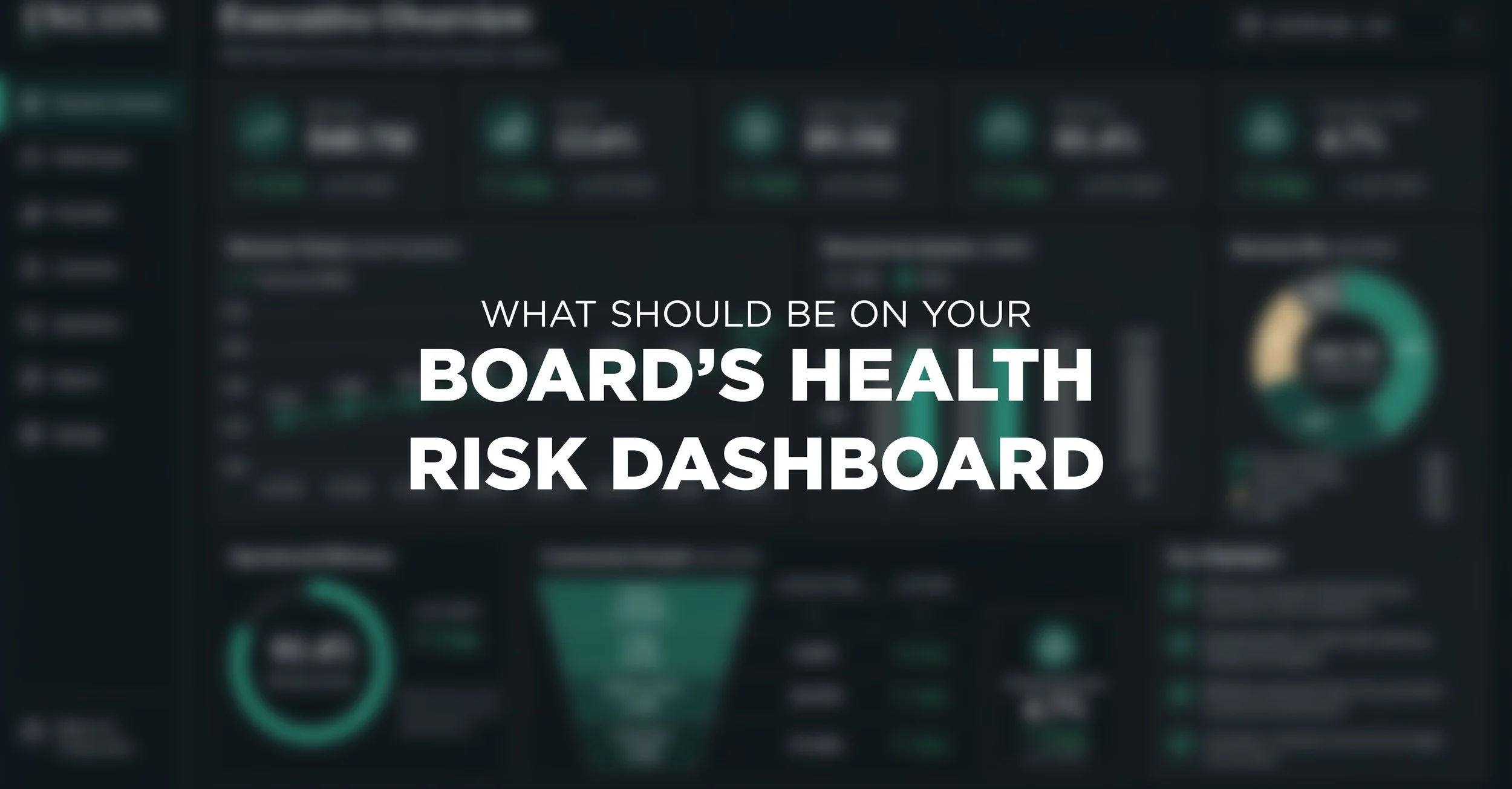
The five metrics worth tracking at board level
Not all health data belongs on a board dashboard. The following five are the ones that carry the most commercial signal:
Absenteeism rate by department and role - not just the organisation-wide number, but the pattern. A spike in a specific team or function is rarely random. It points to something in the environment, the workload or the management structure that is worth understanding before it becomes a retention or performance problem.
COID claim frequency and cost trend - tracked over time and benchmarked against industry. A rising claim rate is a leading indicator of safety culture deterioration, not a lagging consequence of individual incidents.
Medical surveillance completion and findings trends - not just whether surveillance was conducted, but what the aggregate findings show. A pattern of early hearing deterioration across a team, or lung function decline in a specific area, tells you something about exposure controls that no safety audit will surface as quickly.
EAP utilisation rate - tracked against industry benchmarks. Low utilisation is not a sign that employees are coping. It is a signal about culture, trust and the accessibility of support. Both extremes carry cost implications.
Return-to-work timeline for disability and long-term absence cases - tracked against best-practice benchmarks. Organisations with proactive disability management consistently return employees to productive work faster, at lower cost and with better retention outcomes than those managing cases reactively.
What this looks like in practice
A board-level health risk dashboard does not require new data. It requires existing data - currently sitting in HR, occupational health, safety and EAP systems - to be consolidated, interpreted and presented in a format that connects it to financial and operational outcomes.
The conversation changes when a CFO can see that a rising absenteeism rate in a specific division is tracking alongside a low EAP utilisation rate and an incomplete medical surveillance programme. Those three data points together tell a story that none of them tells alone.
Incon Health works with organisations to build exactly this kind of visibility - turning occupational health data into organisational intelligence that belongs in the boardroom, not just the HR report.
If your board is not yet seeing this picture, it is worth understanding what it might be missing.